

Add Sparkle to your Christmas Cards
Avoid dropping the bauble this Christmas and start organising your Christmas communications now.
We have developed sample designs to showcase how we can help to make your 2022 Christmas cards sparkle! Our Xerox Iridesse digital presses allow you to create stunning and unique Christmas card designs using a combination of silver, gold, white and clear inks.
Crisp Metallic Designs
Using metallic silver or gold ink as a base layer underneath standard CMYK can create vibrant, eye-catching metallic iridescent colour palettes. You can use the pre-defined electronic swatches palette for InDesign (available to download here), making specifying a metallic colour as easy as specifying a Pantone.
You can also request a printed sample book so you know exactly what the metallic colours will look like!
Alternatively, you can create your own metallic hues using varying percentages of metallic inks with CMYK. Adding clear ink on top can also extenuate particular parts of your Christmas card design.
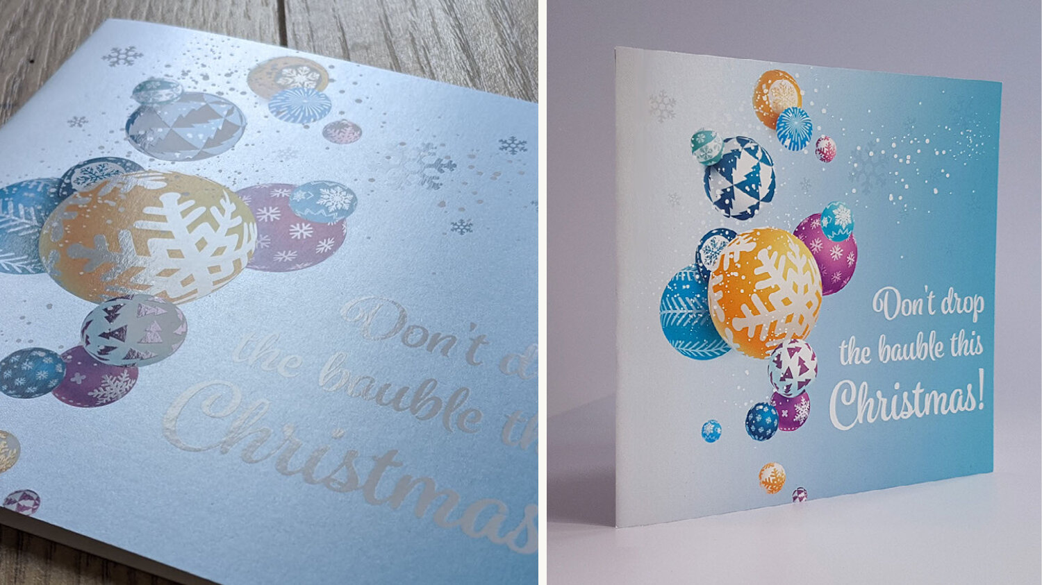
For this Christmas card, we have used a silver base layer, whilst adding a light blue CMYK gradient to give it an icy wintery appearance. We also added clear ink to highlight some features of the baubles, as well as adding some very subtle snowflakes into the design.
We also used a combination of silver and CMYK to create a rose gold effect for this Reindeer design, using different percentages of silver to add depth to the finished card.
Black and Gold?
As well as using metallic inks in combination with CMYK, you can also take advantage of using gold and silver inks directly onto the board, making your metallic ink the centre of your design.
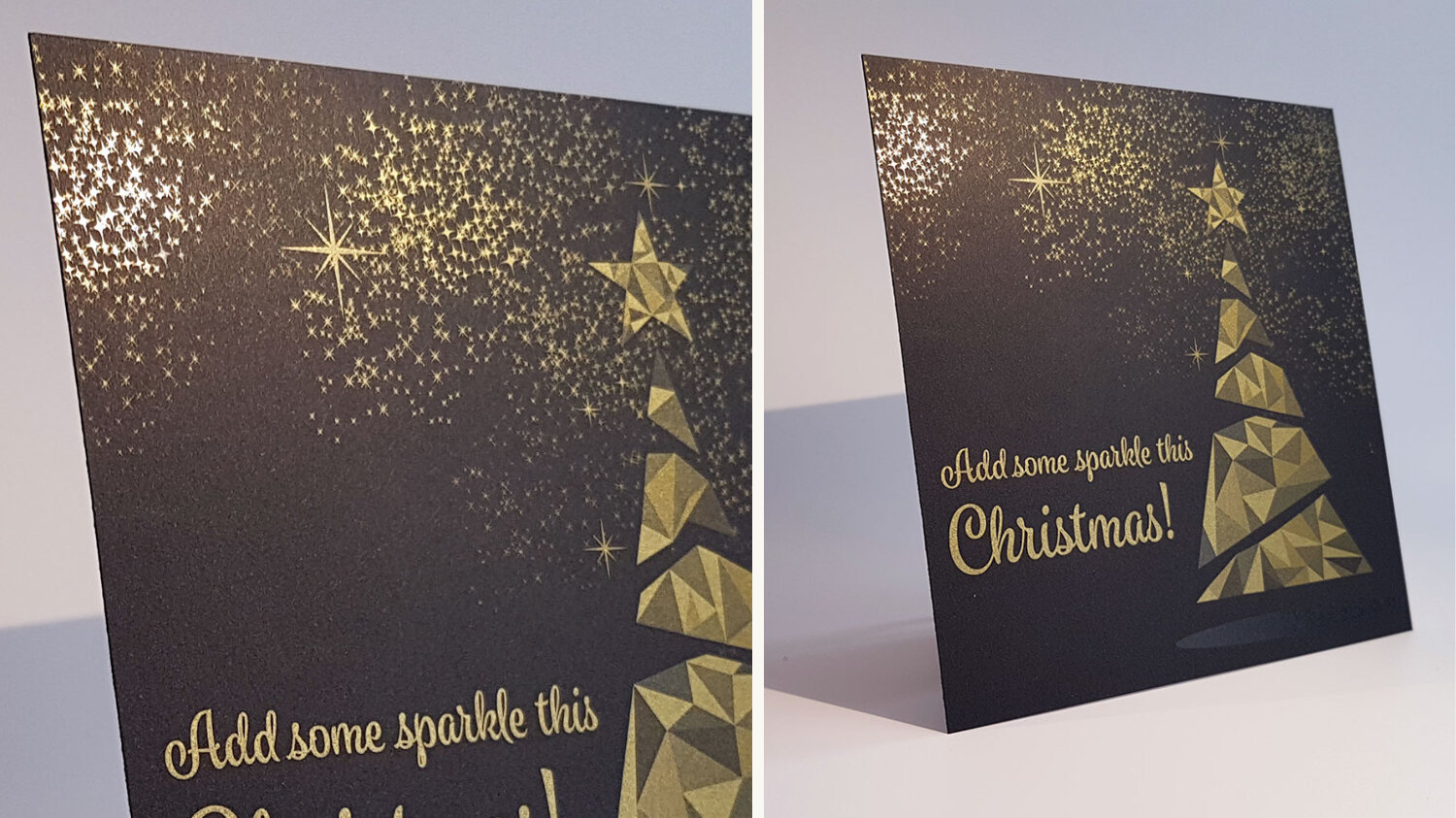
Here we have used varying percentages of gold ink to create a bold and striking Christmas tree design, as well as varying sizes of stars. We have added a shadow in clear ink to the underneath of the tree, giving the impression that it is floating.
Printed on premium black board, it really makes the gold ink pop and stand out. In our sample pack, we also showcase the same sample on white board so you can see the difference that the printing material can make!
Dreaming of a White Christmas
Every year we always hope for a white Christmas! What feels more Christmassy than a cold crisp winter morning with a dusting of snow? Well the Iridesse opaque white ink lends itself perfectly for those snowy wintery scenes.
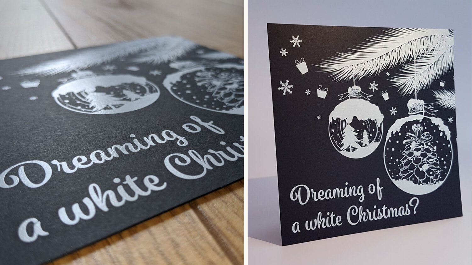
Here we have taken a simple Christmas tree with baubles and given it the snowy treatment. Using the white ink directly onto premium black board gives the design incredible depth, something that a simple CMYK design could not achieve.
Do you have a design in mind that could take advantage of the white ink?
Want a closer look?

Simply request a free Christmas card sample pack to get your hands on all of the samples shown above! As well as that, you can take a look at some short step-by-step videos on how to use metallic, white and clear inks on your designs!
For samples and design assistance, simply fill in the form below 👇